Poster Frame Colours: types of colours, their benefits and FAQs
When buying a poster, you need to consider its frame. Choosing the right frame (and specifically the colour of the frame) will enhance and accentuate your poster. However, if you choose badly, it might distract your eyes from the art.
In this article we will discuss:
- The most popular frame colours
- How should you choose your frame and colour?
- Using colours wheels
- Some golden rules of choosing poster frames.
- Introduce you to the colour wheel and how it can be used to pick the right colour match between frame and poster.
- Discuss more advanced colour matching options such as monochromatic colour selections.
- Look at the psychology of colour, specifically for our core frame colours: black, white, wood & silver.
- Give examples of artwork that best fit each style.
What are the standard sizes of poster frames?
There are a lot of frame finishes and colour options available out there. Standard poster frame finishes are:
How should you choose your frame and colour?
Frames accent the beauty of your artwork or poster. This means they shouldn’t overtake the whole visual interest of your picture. Allow them to adds to the overall aesthetic design without stealing the show.
Here are some of our general tips for framing artwork:
- Coordinate the frame colour with background colours in the poster — The best way to enhance the focal point of the artwork is by coordinating the frame colour with background colours in the poster. Contrasting the frame colour with these colours will help enhance your artwork.
- Avoid frames that are the same colour as specific focal points in the poster (central characters, objects or typeface for example) — This will ensure the frame doesn’t take some of the energy away from the poster’s central objective.
- If the poster is mainly a single colour or has a heavy colour focal point, then the frame should avoid that colour — Instead, look for a complimentary colour or use a monochromatic variation of it (see below).
- Think carefully about the wall colour — Avoid frame colours that clash with the décor in your home. Avoid white frames on white walls and black frames on dark colour walls. If your wall, poster and frame all are different, opt for a triadic colour scheme (see below).
- Use colour wheels to help you decide — Take a look at a colour wheel calculator for some great tips on which frame colours will best suit your poster and the wall your intend to hang the artwork on. Colour theory can really help get you make the correct frame choice.
Using colour wheels
Colour wheels are a useful tool when deciding which frame colour to choose. We recommend you choose a complimentary or monochromatic frame colour. As mentioned in point 2 above, monochromatic colour choices are very helpful when the poster has a central colour on display. Complimentary colors are more general and will ensure you avoid a clashing frame colour.

Above: Example of a monochromatic color scheme by Pluke https://commons.wikimedia.org/wiki/User:Pluke
You can look into more advanced colour matching options. Use the illustration below to find some of the complex colour matching choices used by designers. If your artwork is bright and full of colour, these schemes can be really helpful.
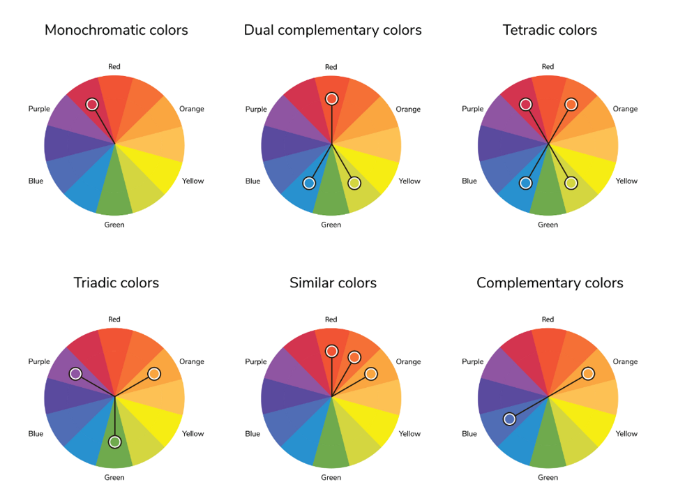
Above: Illustration depicting some practical implementations of Sir Isaac Newton’s colour wheel, including the triadic scheme mentioned above.
Did you know:
The colour wheel was invented in 1666 by Isaac Newton, who mapped the colour spectrum on to a circle. This has been used ever since as a guiding principal by artists and designers around the world. In the world of colour, as in love, opposites attract.

Above: The 1908 Colour Wheel by Arthur h Hatt.
What colour frame goes with...
| Beige Walls |
|
| White Walls |
|
| Cream Walls |
|
| Teal Walls |
|
| Dark Rooms |
|
| Wooden Furniture |
|
Popular frame colours
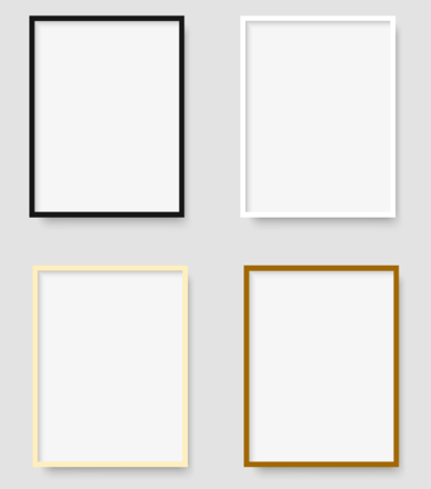
Despite the myriad of possible frame colour options available, the core colours of black, white, silver and wood are the most common and popular choices among our customers. We therefore specialise in these ranges and have provided more help and advice on each, below.
Quicklinks:
There are a lot of frame finishes and colour options available out there. Standard poster frame finishes are:
Black frames

Black frames are incredibly versatile and look stunning on most wall finishes. No matter the type of photograph, artwork or print that you have, a black frame is able to make it stand out on your wall, especially when using a mat board.
The neutrality of the solid black colour allows you to use it as a frame without it being a distraction from the main poster. This adaptability means you can use it with almost any wall colour.
Black finishes carry a balanced tone. This means that you can use a solid black frame in a rustic or contemporary modern house. This colour tends to give a formal and elegant style to your artwork.
Benefits of black frames
While you can use a black frame on most walls, there are some particular cases where black frames are an excellent choice:

- Black frames can work great with light colour walls. They offer the contrast needed to accentuate the picture.
- If you are using a black frame for a movie poster, black frames can help capture the mood of the film.
- Black frames compliment many modern posters (including movie posters). The black frame can help highlight protagonists. It emphasises the shadows around them, and make them the center of attention in the picture.
- Black frames are also the colour of choice for many specific frames, such as record sleeve album frames and collector steel book frames.
- Black is best suited to contemporary décor environments. Any modern space will be a perfect choice for black, especially if the wall is a monochromatic (monochrome) complimentary colour such as grey or white.
Example (right): The Joker poster, full of monochromatic compliments is a great example of when black is the ONLY frame choice. Consider a good sized mat board too!
When shouldn’t you use a black frame?
There aren’t many cases where black frames don’t work, but avoid black in very bright and colourful spaces or where the artwork in question is at odds with the general colour psychology of black.
White frames

White frames are also extremely versatile because white is a neutral colour. White works well with different interior designs and styles without drawing attention away from the framed poster/picture.
This effect is best seen when you combine a white frame with a white mat. The lighter colours help the elements in the foreground to pop out even more.
When should you use a white frame?
Since white is a neutral colour, it compliments most indoor designs and colours. There are some special cases when white is the best choice:

- Posters with heavy amounts of grey and black are a great compliment to white frames. Again, the use of color theory can help make your poster stand out.
- If your setting is for display, white can give your artwork a professional / high-quality look and feel. This works well in environments such as creative studios, gallery’s, architectural offices and photography studios.
- If you want to project a calming environment, perhaps where people may feel nervous, then white can help. Dental practices are a great example of where white can help calm nerves.
- In the home, white is a great choice in calming environments such as bedrooms, study’s and conservatories.
Example (right): White frames are a good choice for framing posters of children’s animation such as Paw Patrol.
When shouldn’t you use a white frame?
It’s rare for white frames to not suit a poster/painting or general room décor. However, there are a few examples.
If you’re planning to use a white frame on a white wall it can potentially reduce the impact of the colour. Ideally, the frame should be allowed to stand out. Try choosing an off-white to differentiate the frame from the surrounding.
The other main consideration to note is the mat board. If you are using one, ensure it isn’t too deep. If it is too deep it could drain life away from the frame itself, so be careful here. Also, make sure the paper is a different shade than the frame itself. Again, this will help avoid unwanted bleeding of colour away from the picture.
Wood frames
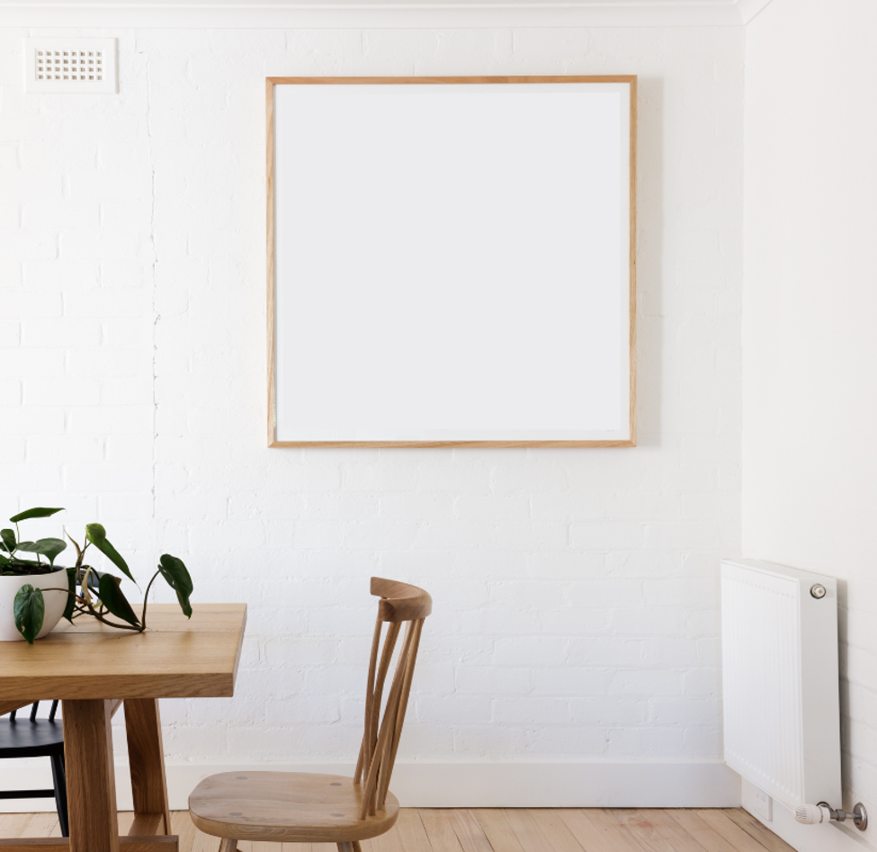
Wood frames range from light to dark depending on the type of wood and the finish used.
The most popular wooden frames are made from oak. As an element of nature, wood gives a vintage and classic feel. The colour of wood also adds a warm tone to artwork and can complement existing furniture and décor more than either white or black.
When should you use a wooden frame?
- Wood is the perfect choice for scenery artwork. The natural wooden tones will compliment images of forests, marine life, seas, oceans and beaches.
- Wood frames work well when they match other parts of a room’s décor. If you have any furniture or ornaments that are made from wood then a wooden frame will neatly fit into the room’s colour scheme.
- Wooden frames with darker tones are great in complimenting and contrasting warmer colours. This makes colours such as red, orange and brown perfect for wood types like oak frames.

Example: Wood frames work perfectly with pictures of nature, including images of marine life.
When shouldn’t you use a wooden frame?
While wooden frames are one of the most aesthetically pleasing colours, they tend to fit classic-designed houses or those which have traditional looking rooms. This means that if you’re opting for a contemporary art style in your interior, a wooden frame might not be your best option.
Silver frames
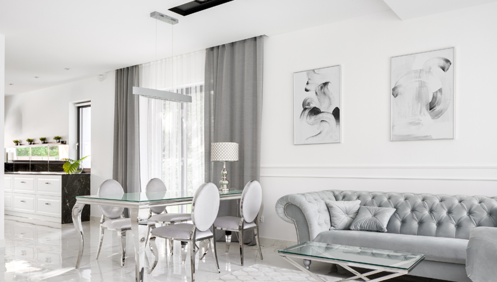
Silver frames have a trendy and modern vibe. The frame’s glossy sheen is excellent at ‘lifting’ the colours of a picture to make them appear more eye-catching and vibrant.
Silver leans towards contemporary style, which will suit modern, stylish homes.
When should you use a silver frame?
In many cases, silver frames are more effective at giving your posters the wow factor than standard black, white or wood colours. Metallic silver is a distinct style which should only be used with the right posters or pictures.
- Silver frames have a classy-looking design. Their reflective nature makes them perfect for darker images or those containing monochrome.
- Silver works very well with futuristic or technology-based artwork.
- Walls on the monochrome scale will look stunning with a silver frame. Any wall in white, black or grey will be complimented by silver frames.

Example: Futuristic artwork looks superb in a silver frame.
When shouldn’t you use a silver frame?
Silver frames are one of the most distinctive frame colours. If your poster or picture involves subtle colours or tones, you may find the silver frame distracting.
Best frames for...
Posters
If you are looking to frame your favourite movie posters, GB poster’s mini or maxi range is your smartest choice.
Mini poster frame
The mini poster frame will house any 40cm x 50cm (15.7 in x 19.6 in) poster comfortably. These are slightly smaller poster sizes than your standard size, which is great if you are looking to hang multiple poster frames.
Available mini poster frame colours:
- Oak
- White
- Black
- Silver
Prices start from £11.19.
Click here to view our range of mini posters.
Maxi poster frame

Maxi posters are the most common size of poster. The maxi poster frame will fit any 61 cm x 91.5 cm (24 in x 36 in) poster comfortably. They will take up a reasonable amount of wall space.
Available maxi poster frame colours:
- White
- Black
- Silver
- Oak
Prices start from £17.39.
Click here to view our range of maxi posters.
Pictures/prints frames

GB posters offers a huge range of print frames in a variety of sizes.
frame dimensions include:
- 12 cm x 12 cm
- 12 cm x 16 cm
- 24 cm x 30 cm
- 40 cm x 40 cm
- 30 cm x 75 cm
- 33 cm x 95 cm(panoramic)
- 50 cm x 70 cm
- 50 cm x 100 cm
- 60 cm x 80 cm
Available maxi poster frame colours:
- Black
- White
- Silver
- Oak
Album cover frames

These frames are designed to exclusively house 12” record sleeves. This is perfect for those who want to show off their music tastes.
Available album cover frame colours:
- Oak
- Silver
- White
- Black
Click here to view 12” album cover frames.
FAQs
This section we will answer some of common questions, including:
- What colour frames should I use for a dark picture?
- What colour frame should I use for a light picture?
- What is the best frame for a black and white picture?
- Can you have different picture frame colours in the same room?
What colour frames should I use for a dark picture?
Your choice of frame for darker pictures or posters depends on whether you want to highlight or contrast the darker elements.
Use a black frame if you want:
- highlight the darker elements
- contrast the lighter elements
Use a white frame if you want to:
- contrast the darker elements
Black and white frames are neutral colours so work well with any other colours. Your choice depends on which elements of the image you are looking to highlight. Black frames create a bold look that will match the dark elements of the image. White frames create a softer focus and don’t catch the eye so easily.
What colour frames should I use for a light picture?
Light pictures can use similar frames to darker ones. Black and white will suit most images as they are neutral colours:
- Black frames will draw the eye to the frame but can wash out the lighter, subtler tones of the picture.
- White frames won’t detract from any part of the image. Try to avoid mounting white frames to white walls as this can cause the frame and picture to fade into the background.
If you want to frame a light picture on a white wall, you can use other light-coloured frames like oak or silver. These won’t detract from the image but also won’t blend too much into the wall.
Do light-coloured pictures look better in light-coloured frames?
This mostly comes down to personal taste. However, if the main subject of your picture/poster uses light colours, it is usually best to use a lighter frame as this will not detract from the picture. You should also take your wall colour into consideration. It is more important to match your frame to the colour scheme of the room than to the colours of your frame.
What is the best frame for a black and white picture?
A black frame is the traditional choice for a black and white piece. If you visit an art gallery, you will likely see wall art fitted into black frames and mounted on to a white wall. However, just because it is the traditional choice doesn’t mean it is the only choice. Silver frames look great on bright-coloured walls, while white frames look better on darker walls. Your frame choice will mostly come down to personal taste and the décor of your interior. Try experimenting to find your style.
Can you have different coloured picture frames in a room?
Yes. Identical colour frames in a room can create a uniformity which some people appreciate; however, it isn’t the only option. Here are a few more ideas:
- An assortment of colours that match your interior’s colour scheme can create a modern stylish look.
- Frames in different sizes and styles but the same colour can strike a balance between uniform and electic.
- Match poster frame colours to an accent wall*.
*An accent wall is a wall which is different in colour to the other walls in your room.